Trouble with the Curve
Trouble with the Curve
Hello BSHM community!
My name is Ellen Abrams, and I am a current PhD candidate in the Department of Science and Technology Studies (STS) at Cornell University.
A few weeks ago, I received the exciting news that I had been awarded the BSHM’s 2018-2019 Taylor and Francis Early Career Award. Included with the award was the opportunity to contribute blog posts to the Society’s website. While I had planned to use my first post to introduce myself and my work, I’m hoping that can wait until later. Instead, I’d like to share some thoughts on the current public health situation that has ended lives and upended communities since late last year and suspended all in-person activities at Cornell and in New York since late last week.
This semester, which will resume online in early April, I’ve been working as a teaching assistant for a course called “Viruses-Humans-Viral Politics.” Professor Chris Roebuck has expertly designed this course to help students (and TAs) think through the social, political, cultural, and biological entanglements that work to construct HIV and AIDS. Some of the same lessons and lenses have also allowed us to engage in thoughtful and open discussion about COVID-19. Since courses have been suspended, I’ve mostly been thinking about the plight of vulnerable populations, the exposed decrepitude of our economic and political systems, and the power of words and stories.
As a historian of mathematics, I’ve also been paying attention to the numbers.
Actually, the mathematics that I study—like much of mathematics—has very little to do with numbers. Yet, numbers have played a defining role in the history of mathematics and in the development of science studies more broadly. We learned from a series of scholars in the 1980s, for example, that the transformation of statistical questions into mathematical questions was inextricably tied to the formation of the modern state. In the first half of the nineteenth century, modern societies were buried in what Ian Hacking describes as an “avalanche of numbers.” The onslaught of numbers helped bring into being the “population” as a new political entity.
Numbers are everywhere right now. They are undeniably important to managing the current epidemic and incredibly messy because of it. Determining the number of infections, for example, is difficult because many who may have contracted the virus have not been tested. Some are asymptomatic. Others do not have access to testing. Even those who have been tested cannot assume every test is reliable. The time delay between data collection and reporting causes confusion, as does the incommensurability of transnational testing systems. Last week, there appeared to be a spike in the number of new cases in China. But really what spiked was the number of new cases reported when officials began counting as positive patients with COVID-19 symptoms regardless of or without laboratory testing.
The world does not come ready to count (especially during a pandemic). Someone must always choose what to count and what not to count (essentially choosing what counts). As scholars of metrics and data have shown, numbers, like all forms of knowledge, are the product of human effort and decision making.
One of the main figures in my dissertation, the early-twentieth-century mathematician Cassius Keyser, once likened abstraction to the act of disregarding. COVID numbers, by way of what they disregard, are an abstraction. They tell a neat version of a messy story. And like a gifted novelist or playwright, they enact the worlds they describe.
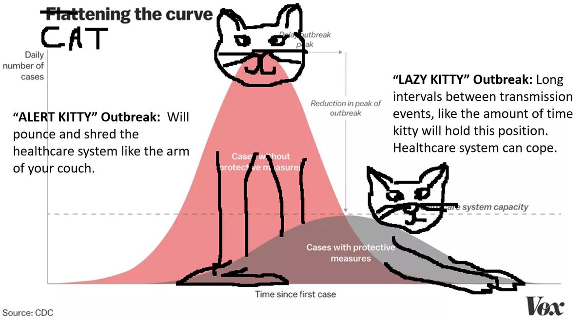
One of the leading characters in the numbers story we are living right now is a numberless representation of the number of COVID-19 cases over time. In 2007, the United States Centers for Disease Control and Prevention published a report on “early, targeted, layered use of nonpharmaceutical interventions,” which included a purple and blue image of two curves: one tall and skinny, the other short and fat.
A similar image has been circulating recently amidst the upheaval, fear, tragedy, and uncertainty of the COVID-19 pandemic. In general, the image is meant to tell those of us who lack expertise in public health that the short, fat curve, in which the number of new COVID-19 cases are spread out over time, is much better than the tall, skinny one, which represents a sudden, steep increase in the number of sick people. Some versions of the image include a horizontal line that represents the number of patients that can be cared for by medical personnel at any given time. The line cuts straight across the tall, skinny curve and just above the top of the short, fat one. Other versions are generated in real time.
Essentially, the image is asking everyone to help make a terrible situation less terrible by working to “flatten the curve.” Social distancing and hand washing will hopefully help delay and lessen overall rates of infection. The image reminds people that the part and the whole, while not the same, are certainly never separate.
“Flatten the curve” joins a long cast of characters in the strange history of American public service announcements. Smokey Bear famously reminded Americans that only they can prevent forest fires. Bert the turtle told them to duck and cover. I was discussing “flatten the curve” the other day with Dr. Luisa Cortesi—a postdoctoral fellow at Cornell and a leading anthropologist of disaster—and we guessed that part of the curve’s appeal might be its role as an educational primer. People are keen to understand big ideas, especially those involving big numbers. It gives them a sense of control. To that end, the verb “to flatten,” while used only once in the original 2007 report, seems well-placed. The act of flattening something can be both powerful and fun. It is a clear and distinct (though abstract) action for people to focus on.
(Side note: Flattening the curve is important right now. So is humor. My favorite interpretation of the curves shows surfers trying to ride steep and gentle waves. The cat one is pretty good too.)
But what is missing from the story told by curves? What gets “flattened” out? The smooth, perfectly shaped curves are obviously cartoon versions of imagined realities—sanitized versions of everyday messiness. Some images have started including a little wiggle in the medical capacity line to account for health care professionals getting sick. This is an important “blip” to note. Blips are everywhere.
My hope is that when people encounter articles, like this one, that speak to them in curves, they remember that numbers are messy and powerful. They can be helpful, and they can be dangerous. I'm worried about a world where a country's curve might be used to justify prejudice and xenophobia. From prior and ongoing global health challenges, including the AIDS epidemic, we’ve hopefully learned that language matters. Numbers and pictures—also forms of language—matter too.
My hope is that people respond to the current onslaught of numbers with kindness and care. At the end of the day, people aren’t numbers. And, as my brother reminded me recently, when it comes to your family (in all its meanings), one is the only number that matters.
BSHM Twitter: @mathshistory